Custom reports
ReportingHandbookCreate custom reports to expedite regular reporting.Custom reporting templates in Timely are a must-have, especially if you use recurring reports that are sent out daily, weekly or monthly. In this article, we’ll show you how to create a report from scratch to save for future use or export and share with your team or clients.
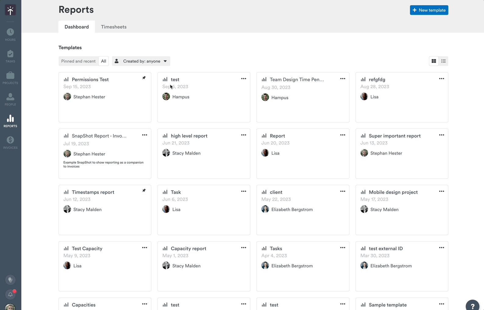
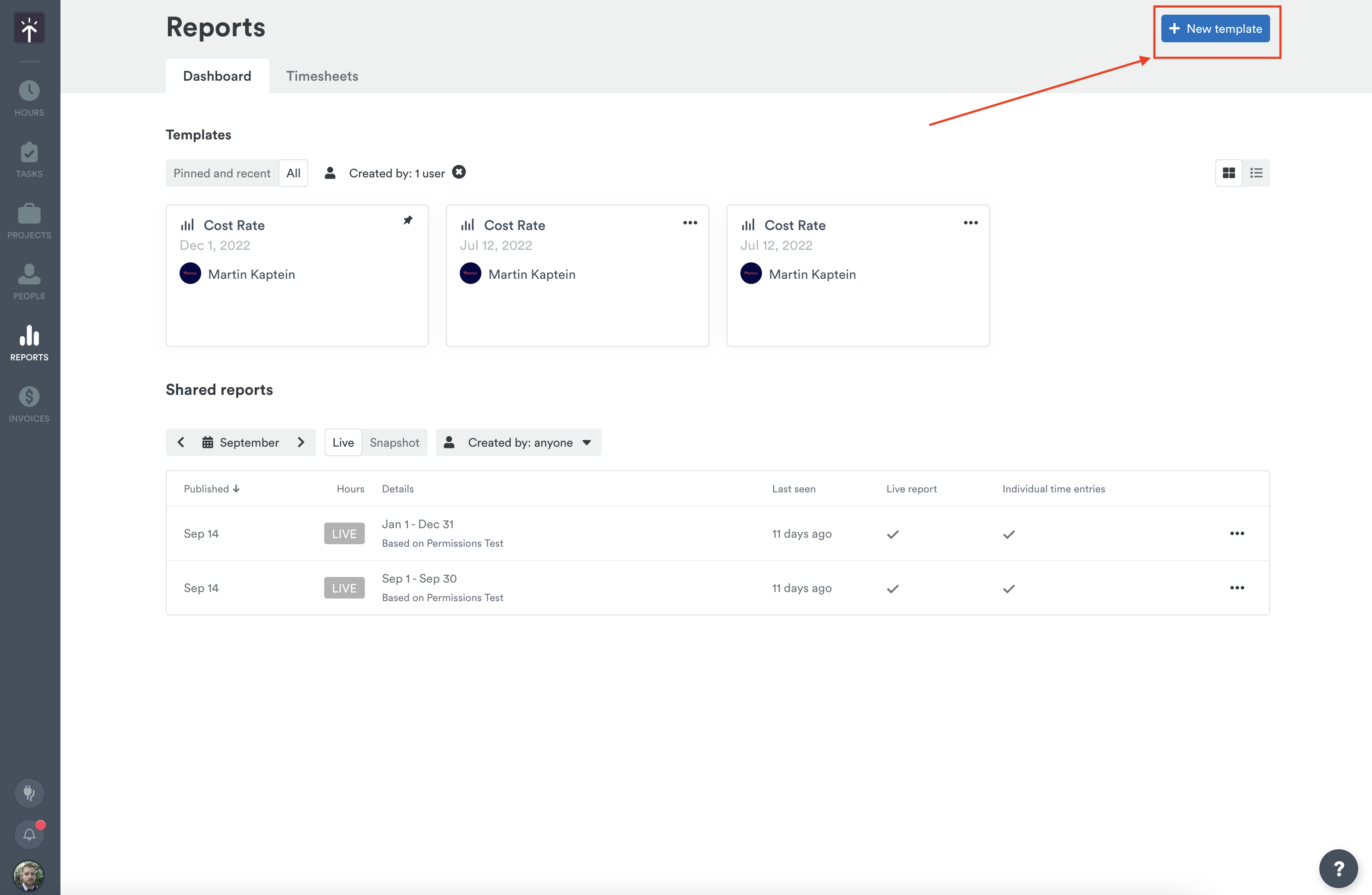
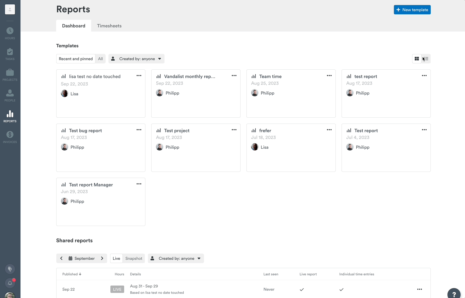
The Reports Dashboard
The Reports Dashboard in Timely has some handy organizational features to help view and access your reports and templates in just a few clicks.
By using the buttons along the top, you can view all the reporting templates you have access to or narrow the focus to just those templates you’ve pinned or worked on recently.
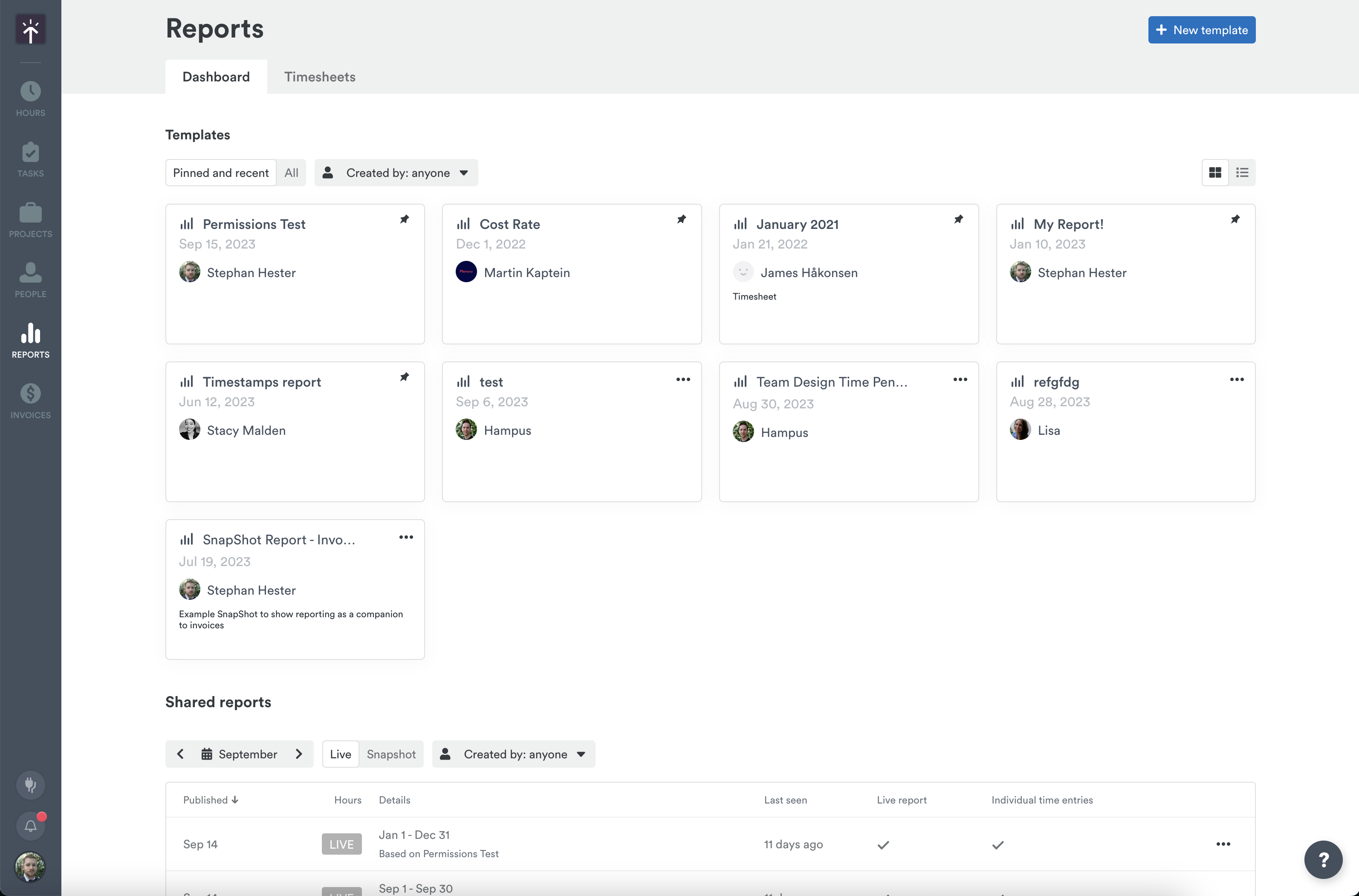
Pinning a favorite or frequently used template is simple! Just click the three horizontal dots to access the context menu and then “Pin template”.
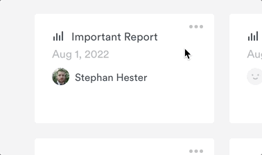
From that same context menu, you can also Duplicate, Share, or Delete that report all in one place.
To make navigating these templates easier, we’ve added a handy drop down letting you view reports created by a specific user or users.
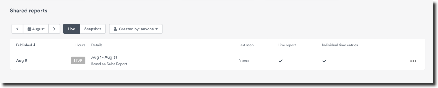
Towards the bottom, you’ll see any reports — either Live or Snapshot — that have been shared externally. You can filter by the month they were created, by Live or Snapshot type, and can view reports shared by specific team members.
Creating a new reporting template
To create a new report from scratch, click the “New template” button in the top-right corner.
Getting started
The very first thing you’ll do when creating a new reporting template is give it a name — you won’t be able to save until you’ve done so. Adding a description is optional, and helps you quickly identify or differentiate your reports.
Customizing your data set with filters
Filters allow you to select the exact data set you’re looking to review. You’ll find the five main inputs for filters right under the title of the report.
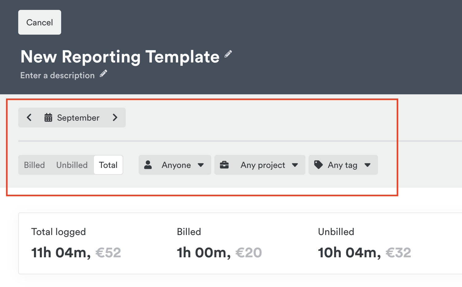
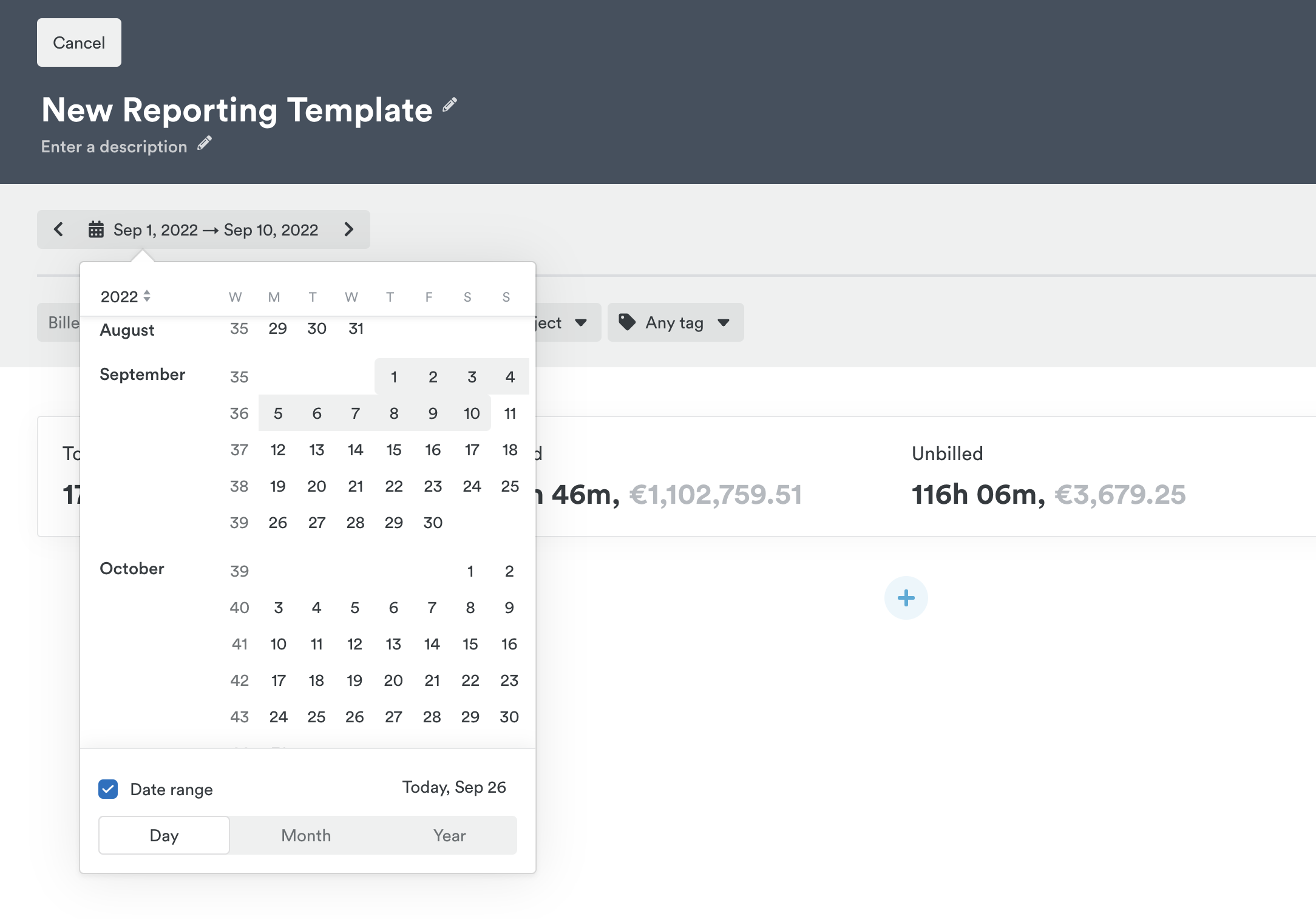
- Click the calendar option to select a timeframe for your template. You can select a specific date range by choosing the “Date range” option or drill down to any specific day, week, or month when the option is unchecked.
- Select which users you want to report on, which can include both active and deleted users. By default, “Anyone” is selected, meaning all users that fit the other filters are brought into the report. Click to select individual users who are active or deleted. If you need to start over, click the “X” that appears over the filter to clear it.
- Select which clients and projects you want to report on. Much like users, “Any project” is selected by default, meaning all projects are pulled in as a part of the filters. You can select from active or archived projects to drill down to a specific project.
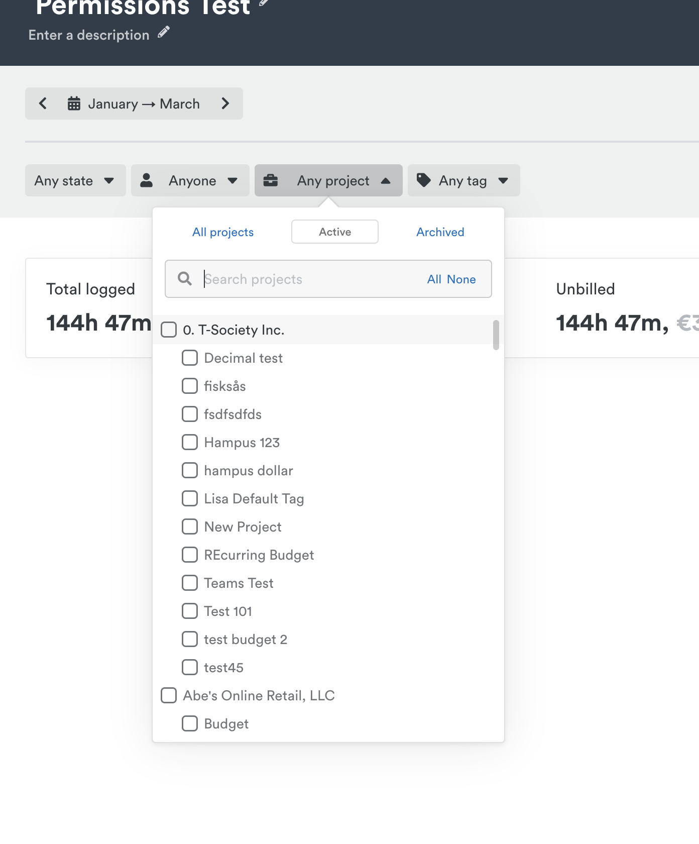
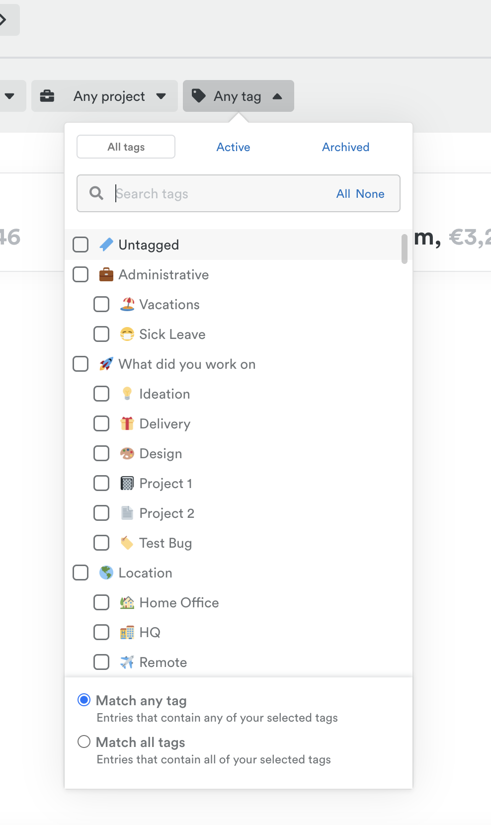
- Select different tags to see where you’ve been spending your time. Follow the same principles for adding tags to a report as you would with users, clients and projects.
- Choose to include billed or unbilled (logged status) hours only, or both together.
Selecting your widgets
- Bar Chart — Ideal for visualizing logged hours over time. Available for the Hours widget. Click the Settings gear to adjust the scale of the chart by day, week, month, year or default. You can also add a median line to visualize the median value.
- Donut Chart — Ideal for visualizing money or hours by client or project. Available for the Hours, Clients, Projects, Tags, and Team widgets. The chart colors are based on your project colors and it displays a percentage of total for an easy breakdown.
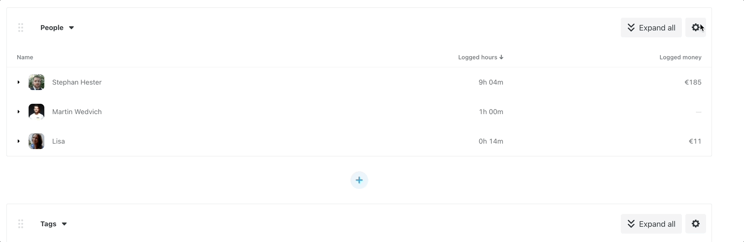
- Table Chart — Provides the most robust view of your data. Available for the Clients, Projects, Tags, People, and Team widgets. Use the Settings option in the upper right-hand corner of the widget to add or remove date, timestamp, tags and notes from individual entries.
Reporting on employee capacity
We’ve revamped our Custom Reporting feature with a new content option — Capacity!
To get started, make sure you have the “People” or “Teams” data modules within your report and then click the gear icon to the top right-hand side. You’ll see the “Capacity”, “Overtime”, and “Undertime” view options and can include or exclude those data points in your report as needed.
You will also see these data points as an option to include or exclude when selecting the columns for report exports.
Analyzing cost, profitability and profit
Track payroll expenses and associated revenues with real-time insights into your profitability. To get started, you’ll want to make sure you have configured both a billable rate (the amount you would charge your customers or clients) and an internal cost rate (your labor cost per employee) for your team.
To deep dive into this analysis you’ll want to ensure you have added either a People, Project, or Tags widget to your custom report. Then, configure the displayed columns in that widget by clicking the gear icon to the top right-hand side. Include Logged Cost, Profit, and/or Profitability columns in that widget to calculate those figures.
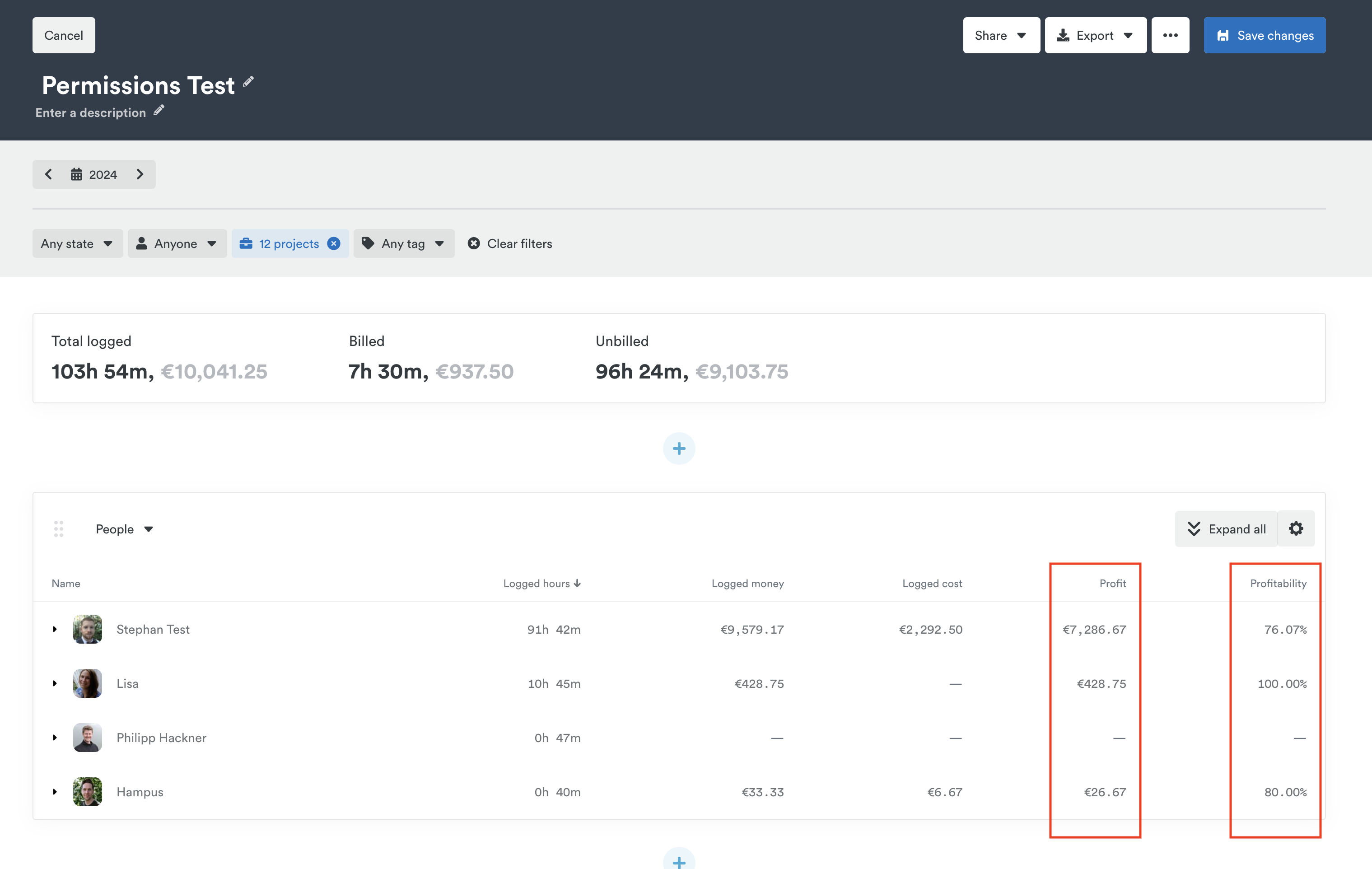
Profit is calculated by taking the logged money of hours and subtracting the logged cost.
Profitability is calculated by taking the profit and dividing it by logged money, displaying that figure as a percentage.
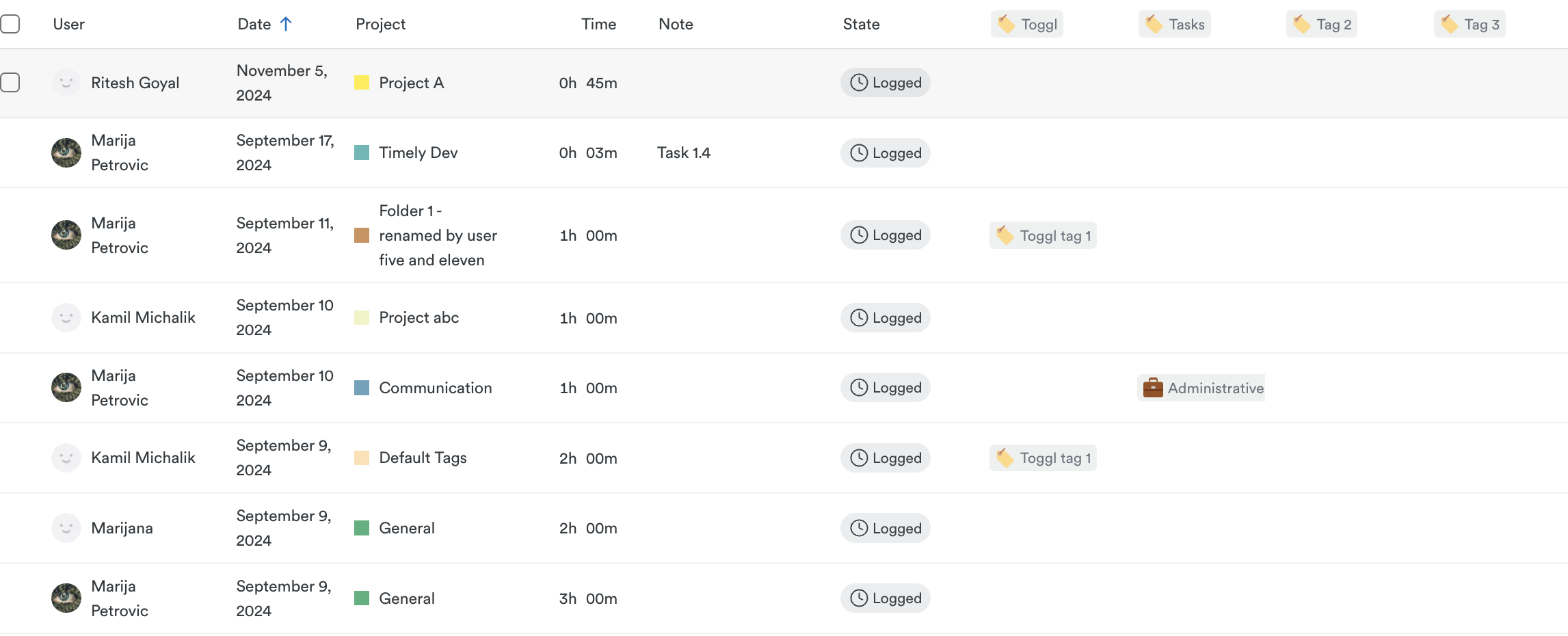
Deep dive into your data with customizable timesheets
Beyond structured reporting templates, customizable timesheets in the Reporting Dashboard let you see a full breakdown of individual time entries — filtered by user, project, team, and more (depending on your access level).
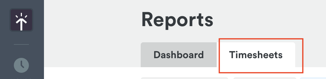
- Head to the Reporting Dashboard and click the Timesheets tab:
- Use the filter options at the top to focus on the entries you need:
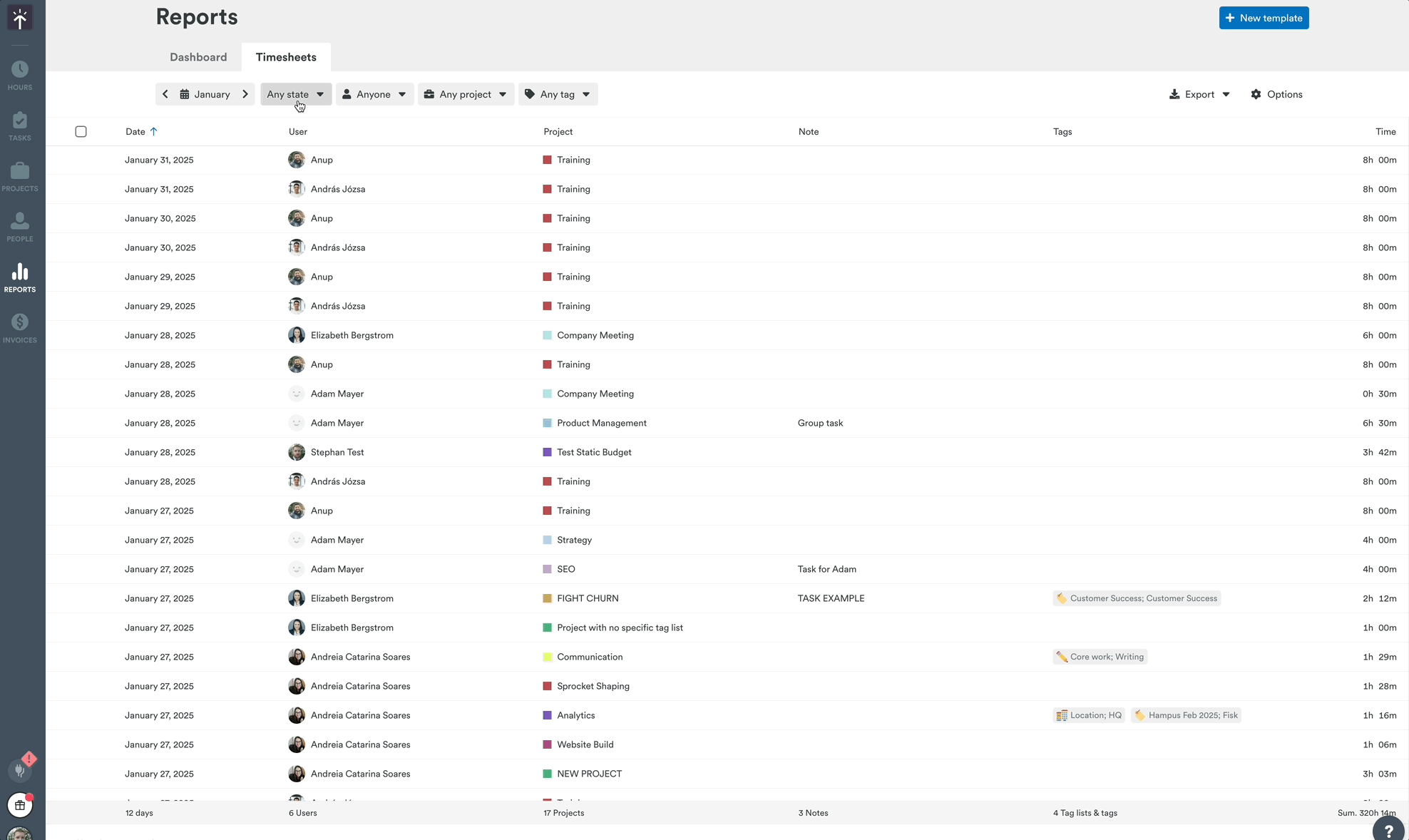
- Click any time entry to see more details — or, if you have the right access, edit unlocked or unbilled hours for other users.
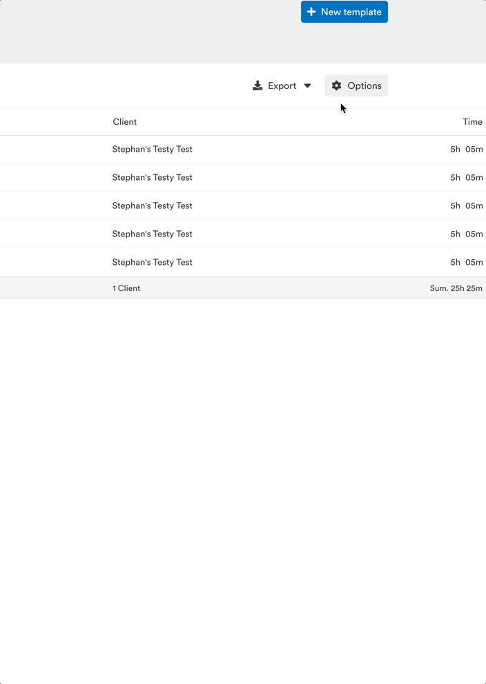
At the bottom of the page, you’ll see the total sum for each column:

Click Options (top-right) to customize which columns and data points appear:
Split tags into separate columns
Want to track hours by individual tags at a glance? Now you can! Go to Options > Tags and select “Separate tags into multiple columns.” Timely will break them out neatly into dedicated display columns — giving you a clearer picture of where hours are being spent.
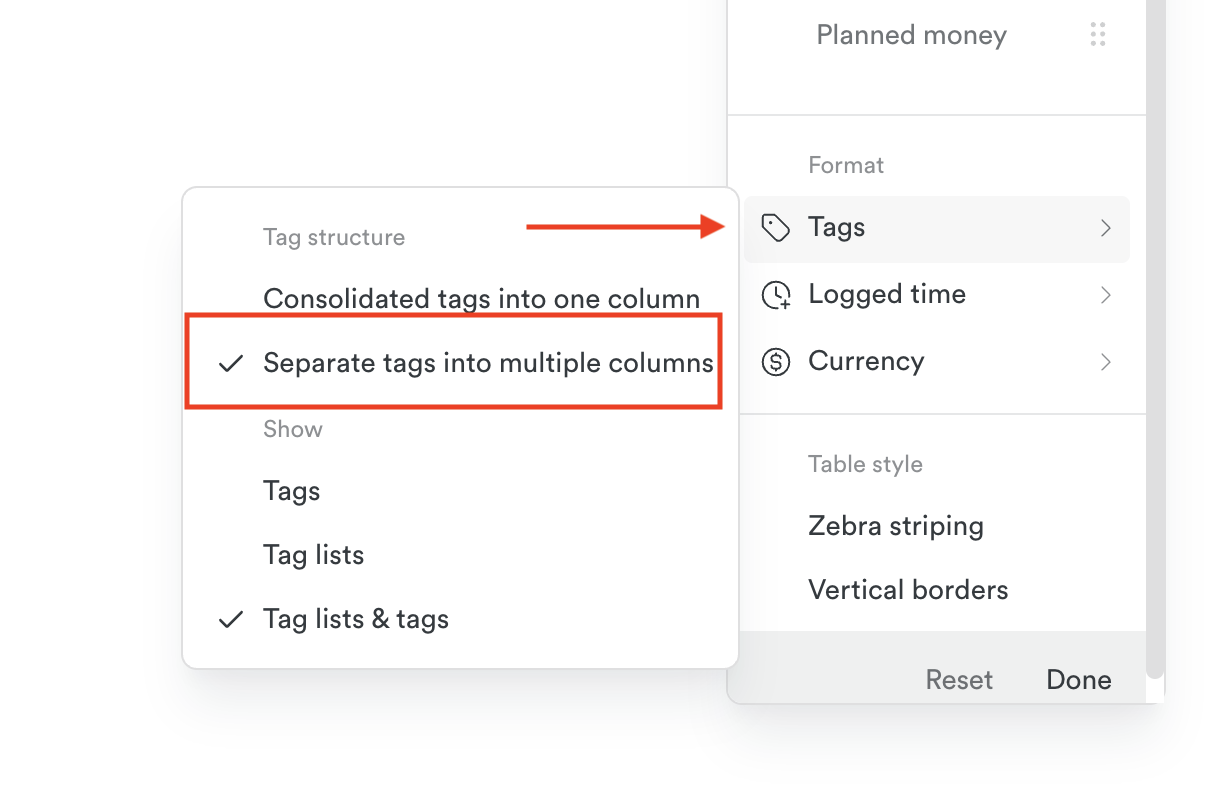
Here’s how it looks:
Tracking clients and projects in the Reporting Dashboard
Looking for a high-level view of how your clients and projects are tracking across time, money, cost, and profit? The new Client & Projects tab in the Reporting Dashboard gives you just that — no setup required. It’s a simple way to scan performance across your active work without needing to build a custom report from scratch.
You’ll be able to filter by client, sort your view, and toggle between daily, weekly, or monthly breakdowns depending on your selected date range.
Learn more about the Clients & Projects tab
Sharing and exporting your report
Once you’ve customized your reporting template, click “Create Template” in the upper right-hand corner of the page. Now you’re ready to share your report or export it to PDF, Excel or CSV.
When you’re ready to report or review this data set again, just select the name of the report from the Dashboard tab in Reports to jump right in where you left off.
Last updated April 15, 2026
Have feedback for this article or need more help? Contact us now.